The glassmorphism trend brings frosted glass effects to user interfaces. Learn how to create stunning transparent elements using backdrop-filter, gradients, and careful layering techniques.
What is Glassmorphism?
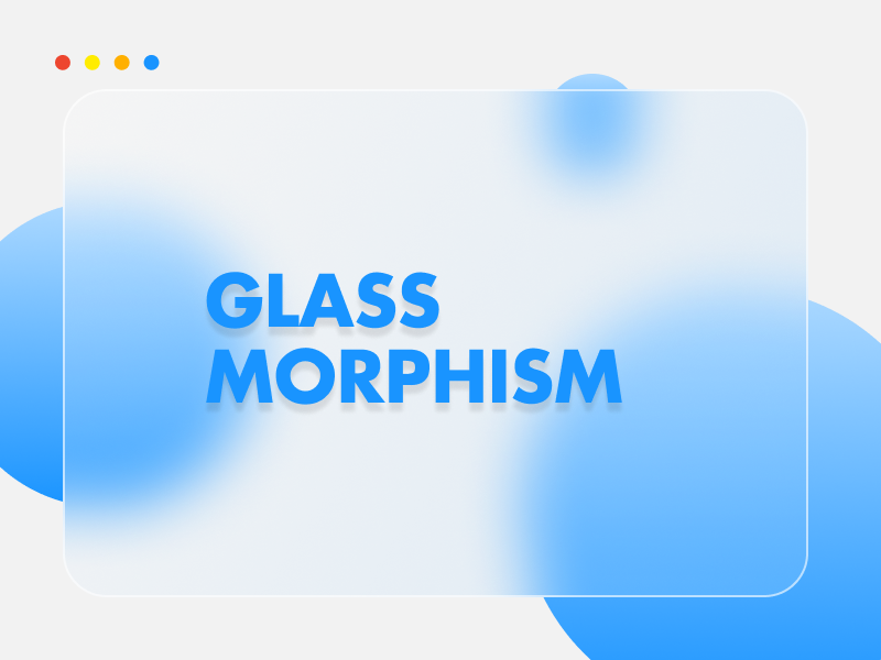
Glassmorphism is a design trend that mimics the appearance of frosted glass. It's characterized by translucent backgrounds, subtle borders, and the distinctive backdrop-filter blur effect that creates depth and visual hierarchy. This aesthetic perfectly captures the essence of Frutiger Aero with its clean, modern feel.
Basic Glass Card
Semi-transparent background with backdrop blur
Enhanced Glass
Added border and stronger blur effect
Colored Glass
Tinted background with gradient border
Essential CSS Properties
Creating convincing glassmorphism effects requires mastering several key CSS properties. Each serves a specific purpose in achieving that perfect frosted glass look.
backdrop-filter
The star of glassmorphism. Creates the blur effect behind the element.
backdrop-filter: blur(10px);
background
Semi-transparent colors that let the background show through.
background: rgba(255, 255, 255, 0.1);
border
Subtle borders that define the glass edge without being harsh.
border: 1px solid rgba(255, 255, 255, 0.2);
box-shadow
Soft shadows that create depth and floating effects.
box-shadow: 0 8px 32px rgba(0, 0, 0, 0.1);
Building Your First Glass Effect
Let's start with a basic glassmorphism card. This foundation can be adapted for buttons, modals, navigation bars, and more.
.glass-card {
    background: rgba(255, 255, 255, 0.15);
    backdrop-filter: blur(15px);
    border: 1px solid rgba(255, 255, 255, 0.3);
    border-radius: 20px;
    padding: 2rem;
    box-shadow: 0 8px 32px rgba(0, 0, 0, 0.1);
}

/* For better browser support */
.glass-card {
    -webkit-backdrop-filter: blur(15px);
    backdrop-filter: blur(15px);
}
Advanced Techniques
Once you've mastered the basics, these advanced techniques will help you create more sophisticated glass effects that truly capture the Frutiger Aero aesthetic.
Gradient Borders
Create stunning rainbow borders that shift with the background:
Gradient Border Glass
.gradient-glass {
    background: rgba(255, 255, 255, 0.1);
    backdrop-filter: blur(15px);
    border: 2px solid transparent;
    border-radius: 20px;
    background-clip: padding-box;
    position: relative;
}

.gradient-glass::before {
    content: '';
    position: absolute;
    inset: 0;
    padding: 2px;
    background: linear-gradient(45deg, #ff6b6b, #4ecdc4, #45b7d1);
    border-radius: inherit;
    mask: linear-gradient(#fff 0 0) content-box,
          linear-gradient(#fff 0 0);
    mask-composite: exclude;
}
Morphing Effects
Add subtle animations that make your glass elements feel alive:
Hover me!
.morphing-glass {
    transition: all 0.4s ease;
    cursor: pointer;
}

.morphing-glass:hover {
    background: rgba(255, 255, 255, 0.25);
    backdrop-filter: blur(20px);
    transform: translateY(-5px);
    box-shadow: 0 15px 50px rgba(0, 0, 0, 0.2);
}
Performance Considerations
Glassmorphism effects can be resource-intensive. Here are some tips to maintain good performance while keeping your effects beautiful:
- Use sparingly: Not every element needs a glass effect
- Optimize blur values: Higher blur values require more processing power
- Consider will-change: Use this property for animated glass elements
- Test on lower-end devices: Ensure your effects don't hurt performance
- Provide fallbacks: Not all browsers support backdrop-filter yet
Browser Compatibility
While backdrop-filter has excellent modern browser support, it's important to provide graceful fallbacks for older browsers:
With Fallback
This looks good even without backdrop-filter support
/* Fallback for browsers without backdrop-filter */
.glass-element {
    background: rgba(255, 255, 255, 0.8);
    border: 1px solid rgba(255, 255, 255, 0.5);
}

/* Enhanced version for supporting browsers */
@supports (backdrop-filter: blur(1px)) {
    .glass-element {
        background: rgba(255, 255, 255, 0.15);
        backdrop-filter: blur(15px);
    }
}
Design Inspiration
The best glassmorphism effects draw inspiration from real-world glass and light interactions. Think about:
- 🪟 Frosted windows on a rainy day
- 🧊 Ice crystals and their transparency
- 💎 The way light refracts through prisms
- 🌊 Water droplets on glass surfaces
- 🌈 Light playing through different materials
Conclusion
Glassmorphism brings a touch of physical reality to digital interfaces, creating depth and visual interest while maintaining clean, modern aesthetics. When combined with Frutiger Aero design principles, these effects can create truly magical user experiences.
Remember, the key to great glassmorphism is subtlety. The effect should enhance your content, not overwhelm it. Start simple, experiment with different values, and always prioritize usability over pure aesthetics.