Skeuomorphic design fell out of favor during the flat design revolution, but elements of it are returning through glassmorphism and neomorphism. What can we learn from this cycle of design trends?
Understanding Skeuomorphism
Skeuomorphism, at its core, is about making digital interfaces resemble their real-world counterparts. The word comes from Greek, meaning "shadow of a tool",essentially, keeping familiar visual cues even when the underlying technology has changed.
Core Concepts
Visual Metaphors
Using familiar physical objects to represent digital functions (calendars that look like paper, buttons that appear raised)
Textural Reality
Adding textures, shadows, and materials to create the illusion of physical depth and substance
Behavioral Mimicry
Making digital elements behave like their physical counterparts (buttons that depress when clicked)
Cognitive Ease
Reducing learning curve by leveraging existing mental models from the physical world
The Golden Age (2007-2013)
Skeuomorphism reached its peak during the smartphone revolution. Apple's iOS interfaces were prime examples, featuring leather-textured calendars, wooden bookshelves, and realistic game tables.
Iconic Skeuomorphic Designs
iOS Apps (2007-2013)
- Contacts app with leather-bound address book texture
- Calendar with torn paper edges and subtle shadows
- Notes app mimicking yellow legal pads
- Game Center with green felt poker table background
Desktop Software
- Media players with realistic stereo components
- Text editors mimicking typewriter aesthetics
- Digital audio workstations with hardware rack designs
- File managers with folder icons that looked like manila folders
The Great Flattening (2013-2020)
Critics argued that skeuomorphism was becoming outdated and unnecessarily complex. The tide turned dramatically with iOS 7's complete redesign, ushering in the era of flat design.
The Backlash
Performance Issues
Heavy textures and complex visual effects consumed processing power and memory, especially problematic on mobile devices
Outdated Metaphors
References to physical objects became less relevant as digital natives grew up without experience with those objects
Scalability Problems
Detailed textures and effects didn't scale well across different screen sizes and resolutions
Visual Clutter
Excessive decoration could distract from core functionality and content
Flat Design Dominance
The pendulum swung dramatically toward minimalism. Flat design emphasized simplicity, typography, and color over texture and depth. This approach dominated for nearly a decade.
Flat Design Philosophy
Simplicity First
Remove all unnecessary visual elements to focus on essential functionality
Typography as Hero
Let typography and content hierarchy carry the visual weight
Bold Colors
Use solid, saturated colors without gradients or textures
Geometric Clarity
Embrace sharp edges and geometric shapes over organic forms
The Unexpected Return
By 2020, designers began to feel the limitations of ultra-flat design. Users struggled with affordances, understanding what was clickable versus decorative. The stage was set for skeuomorphism's revival, but in new forms.
Neo-Skeuomorphic Trends
Glassmorphism
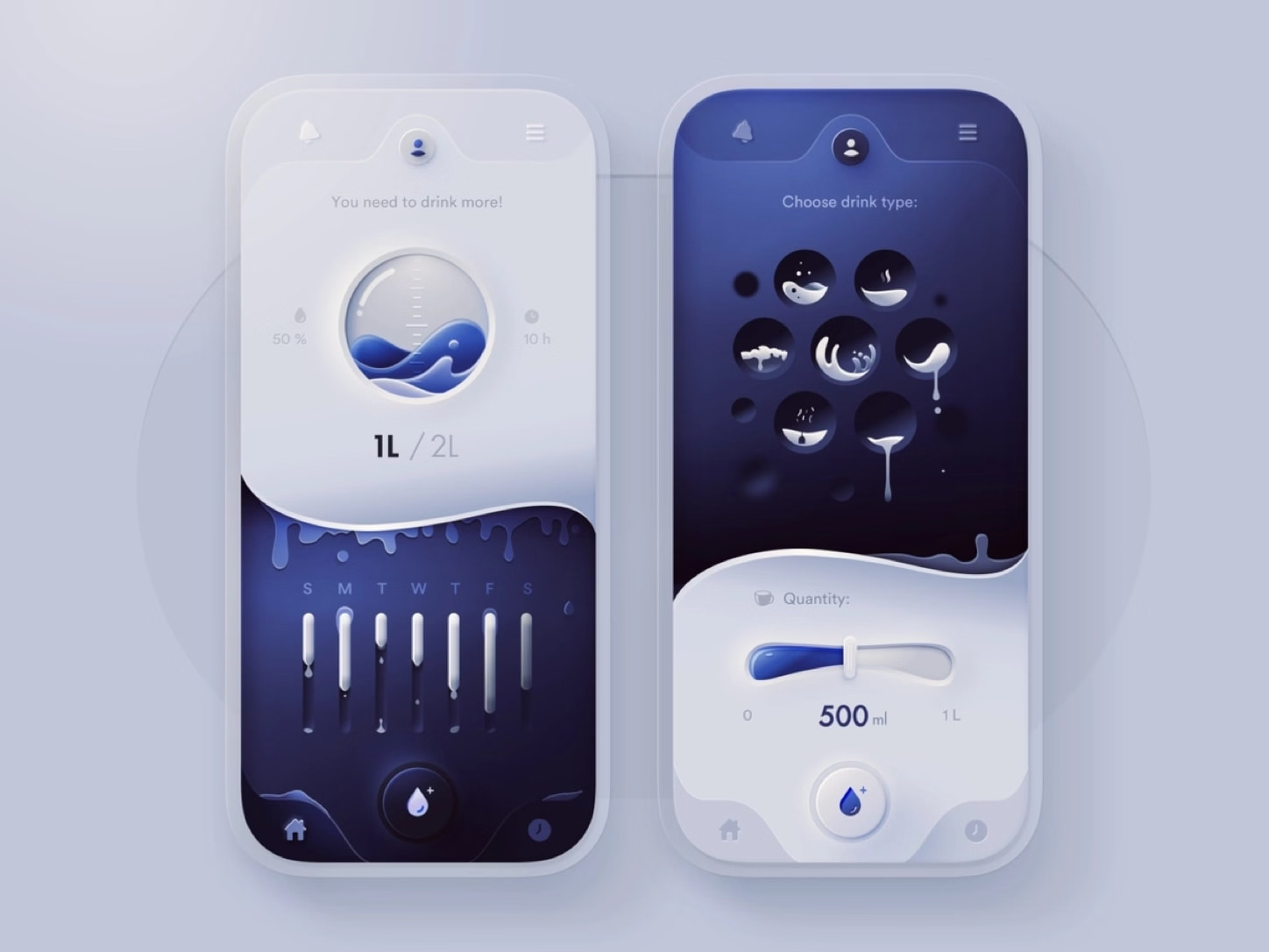
Translucent surfaces with backdrop blur effects, mimicking frosted glass while maintaining modern aesthetics
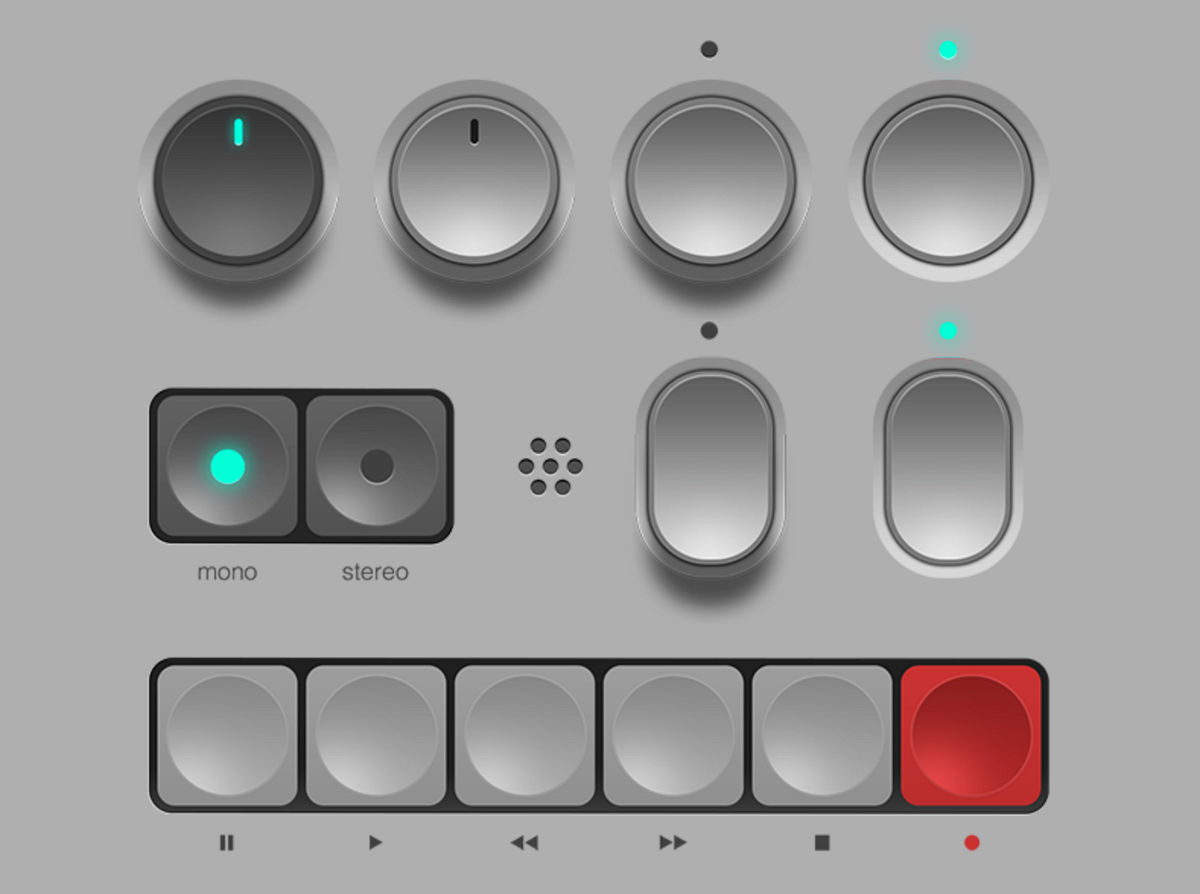
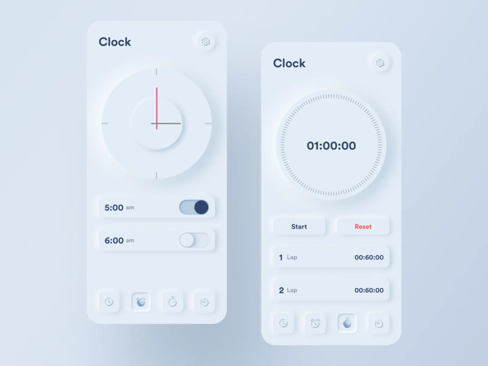
Neomorphism
Soft, extruded surfaces that appear to emerge from or sink into the background, creating subtle 3D effects
Claymorphism
Rounded, inflated elements with soft shadows and highlights, resembling clay or inflatable objects
Why Skeuomorphism Returns
The revival isn't nostalgic,it's practical. As interfaces become more complex and users interact with more diverse devices, visual cues that suggest functionality become increasingly valuable.
Driving Forces
Usability Crisis
Flat design sometimes went too far, making it unclear what elements were interactive. Users needed better affordances.
Improved Technology
Modern devices can handle complex visual effects without performance penalties, making rich design practical again.
Creative Hunger
Designers grew tired of the constraints of flat design and wanted more expressive visual languages.
Platform Diversity
With VR, AR, and various screen types, interfaces needed richer visual hierarchies to remain comprehensible.
Lessons from the Cycle
The death and rebirth of skeuomorphism teaches us valuable lessons about design evolution and the importance of balance in visual communication.
Key Takeaways
Balance is Essential
Neither extreme minimalism nor excessive decoration serves users well. The sweet spot lies in thoughtful, purposeful design choices.
Context Matters
What works for one platform, audience, or use case may not work for another. Design decisions should be contextually appropriate.
Technology Enables Trends
Design trends are often limited or enabled by technological constraints. As technology evolves, new aesthetic possibilities emerge.
Users Need Guidance
Visual cues that help users understand functionality will always have value, regardless of current style trends.
Modern Skeuomorphism in Practice
Today's designers are finding ways to incorporate skeuomorphic principles without falling into the traps that led to its initial downfall.
Contemporary Applications
Mobile Interfaces
- Subtle button elevation to indicate interactivity
- Card-based layouts with soft shadows
- Translucent navigation bars
- Haptic feedback mimicking physical button presses
Web Applications
- Glassmorphism for modal overlays and panels
- Neomorphic form controls for better usability
- Soft shadows to create visual hierarchy
- Smooth animations suggesting physical properties
Emerging Platforms
- VR interfaces that mimic real-world physics
- AR overlays that respect lighting conditions
- Voice interfaces with visual feedback
- Automotive displays with familiar control metaphors
The Future of Skeuomorphism
Rather than complete cycles of death and rebirth, we're likely to see continued evolution toward "enlightened skeuomorphism",selective use of realistic elements where they truly serve user needs.
Looking Ahead
Adaptive Realism
Interfaces that adjust their level of skeuomorphism based on user expertise and context
Physics-Based Design
Using real-world physics principles to create more intuitive digital interactions
Cultural Skeuomorphism
Drawing metaphors from digital-native culture rather than just physical objects
Sustainable Richness
Creating visually rich experiences that don't compromise performance or accessibility
Final Reflection
The story of skeuomorphism's death and rebirth reminds us that in design, as in life, what goes around often comes around, but usually in a more evolved form. The key is learning from each cycle to create better experiences for users.