The early 2000s brought us a unique aesthetic that perfectly captured our optimistic vision of the digital future. Frutiger Aero, with its glossy surfaces, translucent elements, and nature-inspired themes, represented a time when technology felt more human and hopeful.
The Genesis of Frutiger Aero
Named after the Swiss typeface designer Adrian Frutiger, this design movement emerged in the late 1990s and dominated the early 2000s. It was characterized by a unique blend of technological sophistication and organic, nature-inspired elements. Think of Windows Vista's glass effects, the original iPhone's reflective surfaces, or the way water droplets seemed to dance across every interface.
"Frutiger Aero wasn't just a design trend, it was a philosophy that technology could be both powerful and beautiful, efficient and emotional."
Key Visual Elements
What made Frutiger Aero so distinctive? Several core elements defined this aesthetic:

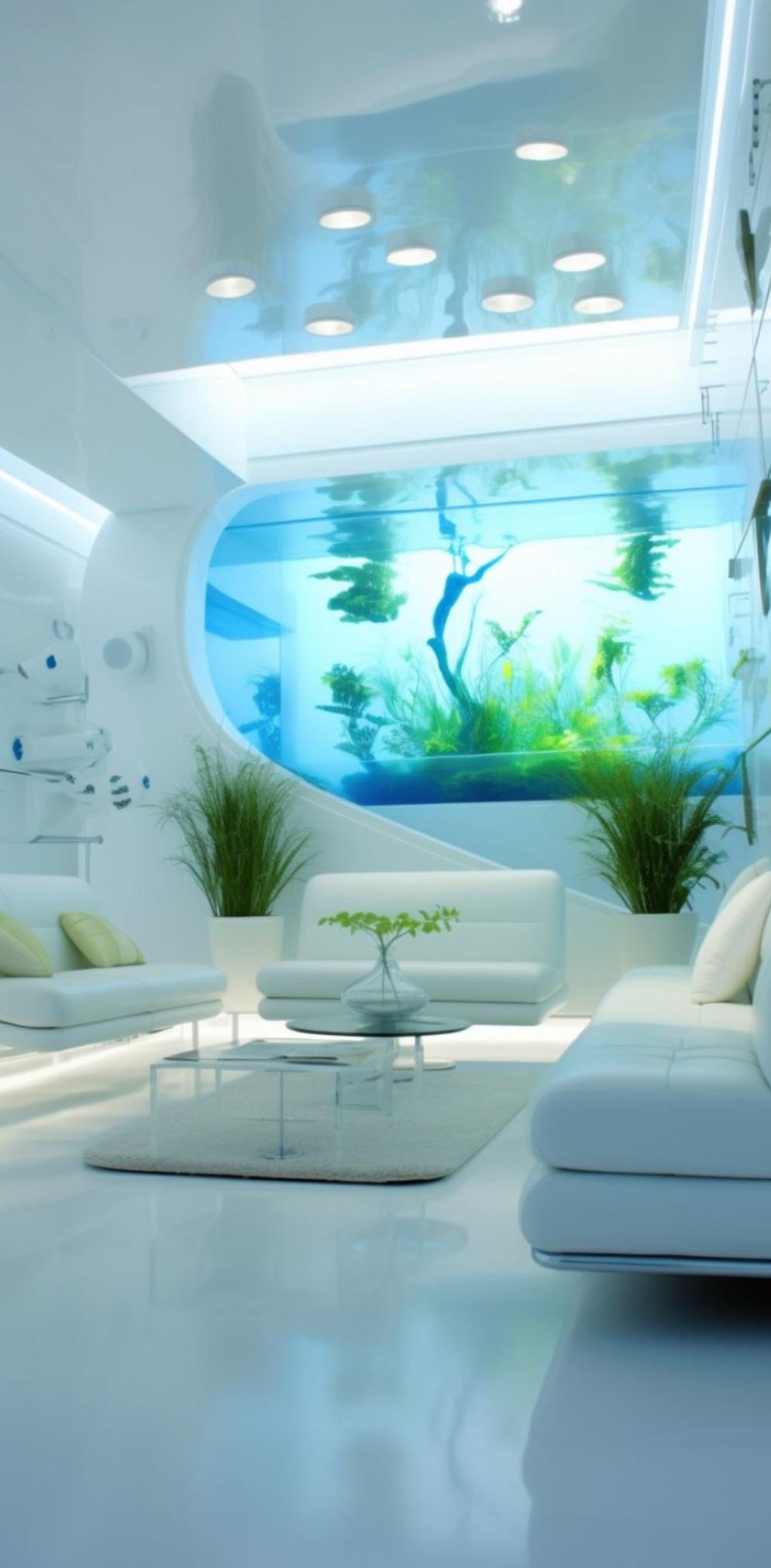
- Glossy Surfaces: Everything had a wet, reflective quality that suggested depth and tactility
- Translucent Overlays: Layers of semi-transparent elements created visual depth
- Nature Motifs: Water droplets, clouds, leaves, and organic shapes were everywhere
- Soft Gradients: Smooth color transitions that mimicked natural lighting
- Rounded Corners: Sharp edges were softened to feel more approachable
The Technology Behind the Magic
Achieving the Frutiger Aero look required pushing the boundaries of what web browsers could do at the time. CSS3 was still emerging, and many effects required creative workarounds:
.glass-effect {
    background: rgba(255, 255, 255, 0.3);
    backdrop-filter: blur(10px);
    border: 1px solid rgba(255, 255, 255, 0.2);
    box-shadow: 0 8px 32px rgba(0, 0, 0, 0.1);
}
Today's CSS makes it much easier to recreate these effects. The backdrop-filter property, advanced gradients, and sophisticated shadow effects allow us to build authentic Frutiger Aero interfaces with pure CSS.
Why Frutiger Aero Matters Today
In our current era of flat design and minimalism, there's something refreshing about Frutiger Aero's unapologetic richness. It reminds us that interfaces can be both functional and delightful, that technology doesn't have to feel cold or sterile.
The resurgence of interest in Y2K aesthetics and the growing fatigue with overly simplified interfaces has created a perfect moment to revisit these design principles. Modern tools and techniques allow us to implement Frutiger Aero effects more efficiently and with better performance than ever before.
Implementing Frutiger Aero Today
When bringing Frutiger Aero into modern web design, consider these approaches:
Performance Considerations
Use CSS transforms and modern properties like backdrop-filter instead of image-heavy solutions. This ensures your glassy effects work well across devices while maintaining good performance.
The key is finding the right balance, capturing the essence of Frutiger Aero while adapting it for today's web standards and user expectations. It's not about recreating 2003 exactly, but about bringing forward the best aspects of that optimistic, human-centered design philosophy.
Conclusion
Frutiger Aero represents more than just a design trend, it embodies a hopeful vision of technology's role in our lives. As we navigate an increasingly complex digital landscape, there's value in remembering a time when interfaces felt magical, when every interaction was an opportunity for delight.
By thoughtfully incorporating Frutiger Aero principles into modern web design, we can create experiences that are both functional and emotionally engaging. The future of web design might just be found by looking to the past.